Data Visualization
What is it?
Data visualizations are “a display of data designed to enable analysis, exploration, and discovery” (Alberto Cairo). Typically, this is done by transforming the values in plain spreadsheets into visual formats such as charts, graphs, and maps. These visual representations enable people to quickly identify patterns and insights.
But data visualization isn’t only about aesthetics—it’s also about storytelling. By selecting the right visual format, using clear labels, and highlighting the most critical points, you can guide people in understanding the data and drawing meaningful conclusions. However, it’s important to remember that visualizations often come with their own predefined messages from the creator and are therefore not without their own bias.
A wide range of tools and platforms can be used for data visualization:
- Everyday Data Visualization: Microsoft Excel is still great for quickly generating basic graphs and charts.
- Interactivity: Tableau and Power BI transform raw datasets into interactive dashboards.
- Automated visualization: Python libraries like Seaborn, Matplotlib, and Plotly offer even more advanced customization and flexibility.
- If you have a location component: QGIS and ArcGIS are essential for #mapping and analyzing location-based data.
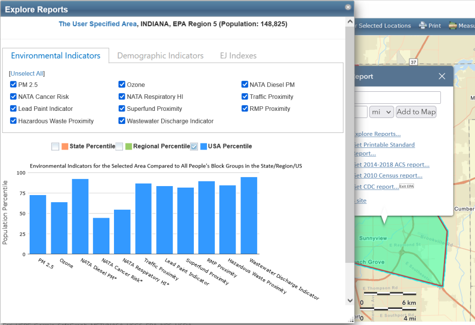
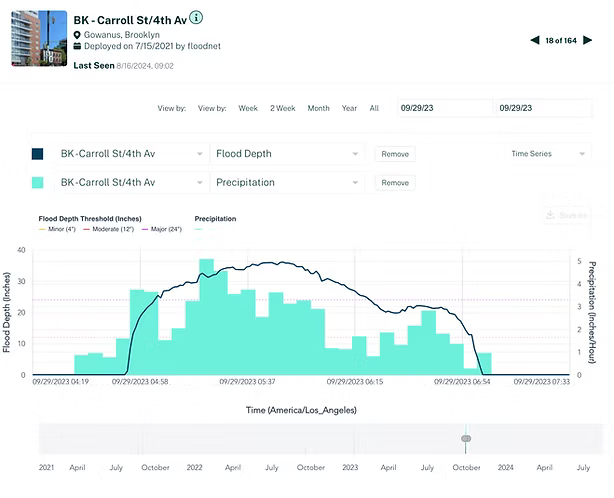
Why does it matter?In a time where people are overwhelmed with information, data visualization helps support informed decision-making. For example, during the COVID-19 pandemic, interactive dashboards displaying infection rates allowed both policymakers and the public to quickly grasp infection trends and make informed choices. Whether you’re advocating for communities like in the EJScreen tool or monitoring flooding in NYC, data visualizations help you get your story across in a way that’s personal to your organization’s mission.
Mentioned and additional Resources:
- For more on data visualization types, check out The Data Visualization Catalogue, a reference guide to different types of data visualizations and when to use them.
- To learn about effective data storytelling, check out the Storytelling with Data blog (and book).
- To learn about visualization design principles, read The Functional Art by Alberto Cairo
- To learn about organizational data storytelling, read How to tell your organisation’s data story, a helpful resource to help you start small and work backwards.